Python integration
GA3 Python nodes support a wide range of Python packages, enabling advanced data analysis, visualization, and computational capabilities. By integrating scientific libraries directly into GA3 recipes, the platform’s functionality can be extended to meet specific research needs. Whether performing statistical analysis, processing images, analyzing large datasets, or applying machine learning techniques, Python nodes offer the flexibility to enhance workflows with customized scripts.
This section provides examples of how various scientific Python packages can be used within GA3, helping to streamline research and maximize the available tools.
For more GA3 examples, check the Laboratory Imaging GitHub repository GA3-examples.
NIS-Express comes with many scientific packages preinstalled. In order to install additional python modules use separate environments or managed environment in the Python node (see below).
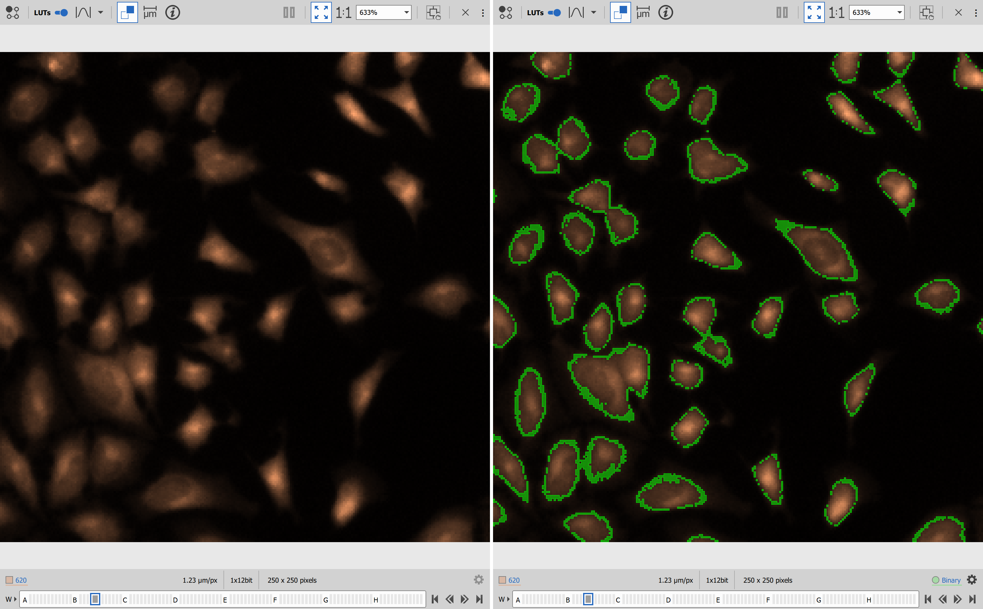
NumPy for simple threshold
This workflows showcases a simple working example of using NumPy library for segmentation (see numpy.org).
Setup
Open the file that needs to be segmented.
In NIS Express GA3 Editor:
- Add Python node and open its settings
- Add color input
- Add binary output
- Insert code from Code section.
- Connect the input pin to the Channels output to be segmented.
- Connect the output pin to the SaveBinariesHDF5 node.

Code
| |
The code:
- Imports NumPy. [
line 3] - Names binary output as “Binary” and sets its color green. [
line 7] - Get color data. [
line 15] - Segments values in range from 300 to 400 (edit as needed) [
line 16] - Stores data to output as unsigned 8bit integer. [
line 17]
Results
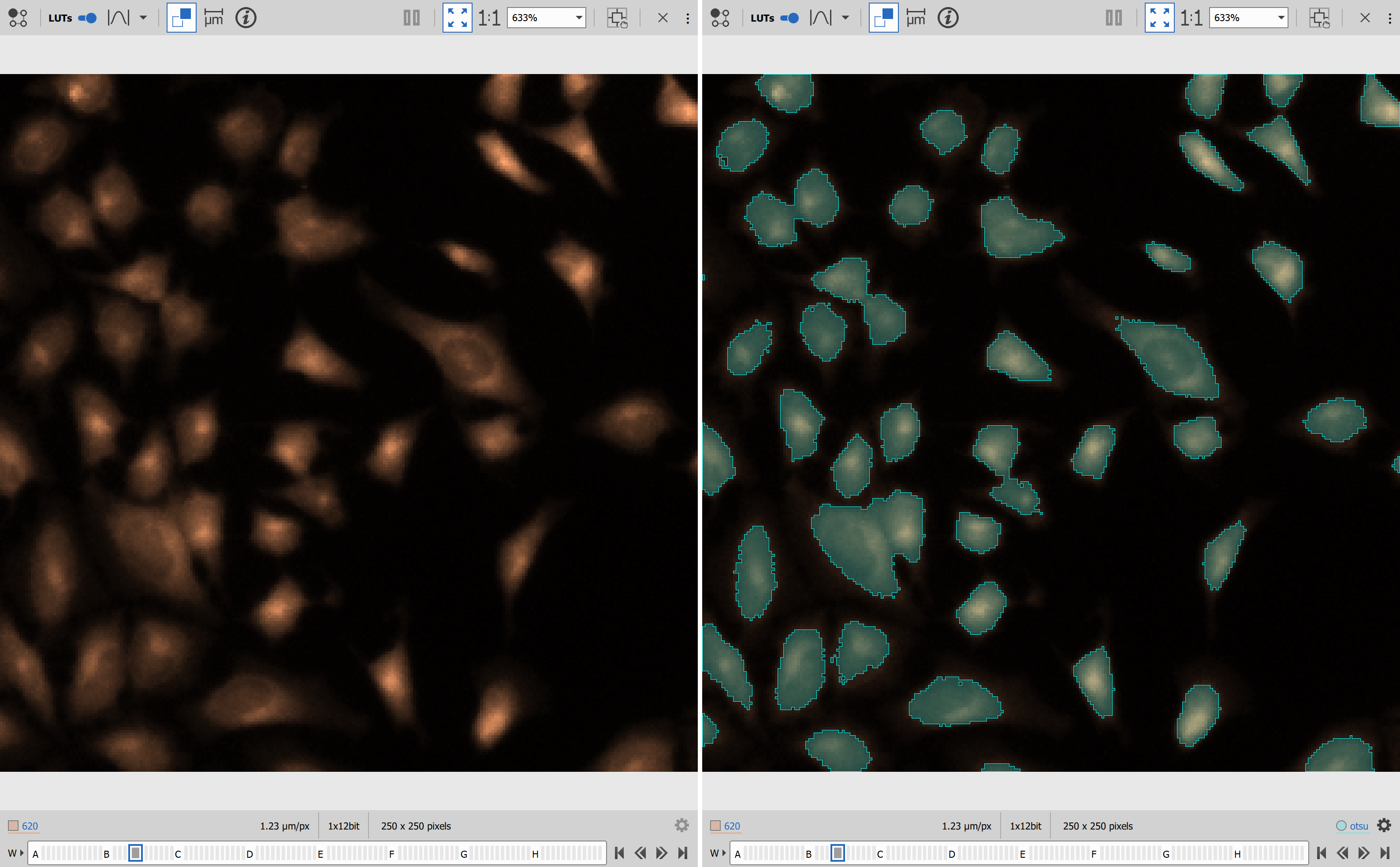
scikit-image for segmentation
Scikit-image is “a collection of algorithms for image processing” (see scikit-image.org).
Setup
Open the file that needs to be segmented.
In NIS Express GA3 Editor:
- Add Python node and open its settings
- Add color input
- Add binary output
- Insert code from Code section.
- Connect the input pin to the Channels output to be segmented.
- Connect the output pin to the SaveBinariesHDF5 node.

Code
| |
- Imports NumPy and filters from the scikit-image package [
lines 2, 3]. - Defines the output to be a new binary named “otsu” and sets cyan color. [
line 7]. - Takes the image from the inp array [
line 15]. - Calculates the threshold calling threshold_otsu [
line 16]. - Creates the binary by directly comparing the values from the image with the threshold value [
line 17]. - Sets the binary data into the out array while converting to the proper format (uint8 or int32 for binary IDs) [
line 18].
Results
BaSiCPy for shading removal
BaSiCPy is a library “for background and shading correction of optical microscopy images” (see BaSiCPy).
Setup
Open the file that needs to be processed.
In NIS Express GA3 Editor:
- Add Channel input.
- Add Channel output.
- Set the python mode to “Managed environment”
- Insert the environment from the Environment section.
- Insert the code from Code section.
- Connect the input pin to the Channels output to be processed.
- Connect the output pin to the SavePictures node.

Environment
channels:
    - conda-forge
dependencies:
    - python=3.10
    - pip
    - pip:
        - "scipy<1.13"
        - "jax[cpu]==0.4.13"
        - "hyperactive<5"
        - "ml-dtypes==0.2.0"
        - basicpy
variables:
  PIP_FIND_LINKS: "https://whls.blob.core.windows.net/unstable/index.html"
  PIP_USE_DEPRECATED: "legacy-resolver"
The environment was created and tested in the November, 2025.
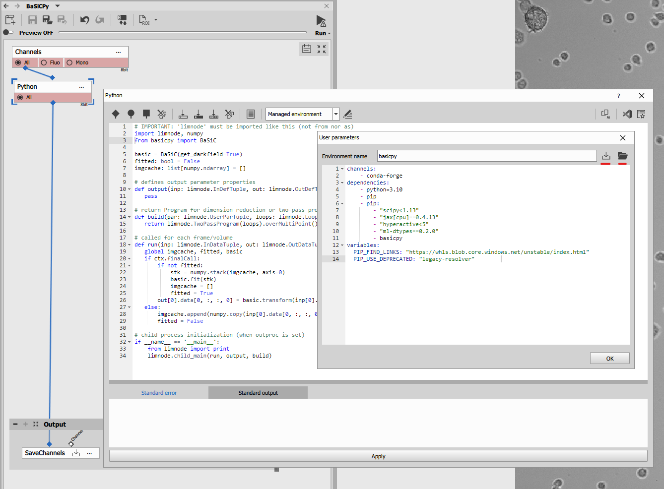
Code
| |
- Imports NumPy and basicpy from the BaSiC package [
lines 2, 3]. - Initializes global variables for two pass processing [
lines 5-7]. - Sets up two pass progam [
line 15]. - Enables using global variables in run [
line 19]. - Calculates shading correction (only once) and applies to every frame in second pass[
lines 21-26]. - Collects data in first pass [
lines 27-29].
Results
Matplotlib for data visualization
Matplotlib comes with NIS-Express. For node-level reference, see Matplotlib node.
This example will built on and modify the Object counting example.
Open the
02_count_in_t.nd2time-lase nd2 image and02_object_count_fluo.ga3recipe.
Replace both graph nodes with a Python node. Both having Table as single input and single output.

Object count vs. time
- In the
output()function [line 37] make the table result and provide it with input parameter (for taking the accumulation from theinp[0]), - define the
draw_graph()function [line 19] that actually draws the graph giving it the x, y data and background and foreground colors, - call the draw_graph function twice for generating light and dark graphs [
lines 48, 49] and finally - call the
withMplImage()method [line 52] to render the matplotlib figure into an image.
The withMplImage() takes following arguments:
- a tuple with ND loop indexes of the current frame or accumulated loop
(
ctx.inpParameterCoordinates[i]whereiis the index of the input parameter is a good starting point) and - a single figure or pyplot object or tuple of two such objects for light and dark color scheme.
matplotlib.pyplot global instance which may be in
unexpected state when the node run function is called. | |
The above python code produces following line chart.


Histogram of object sizes per frame
Similarly with histogram:
| |
The above python code produces following histogram.

Conclusion
These two examples are not the fanciest plots. They lack interactivity compared to native GA3 plots because they are rendered into a static image (or two: light and dark). However, based on aggregation of inputs and loop coordinates, behavior still changes with context. For example, the histogram changes with frame, while the counts-vs-time chart stays fixed when built from one accumulated table.
Matplotlib: Statistical boxplots
This example shows how to use the AI Prompt feature in the dedicated Matplotlib node to generate the code for two custom statistical charts from a results table. The first graph compares Live and Dead cell populations directly. The second graph extends the same dataset into a per-well comparison of Live and Dead populations.
Setup
This example builds up on Wellplate assays: Live/dead discrimination block.
Compared to the base live/dead workflow, the custom recipe adds a measurement node that calculates the values used by both Matplotlib graphs. The .ga3 file contains the exact node wiring.
The recipe should produce a results table with at least these columns:
CellCircularityCellLiveCountWell
The Matplotlib node reads this table directly and generates the graph from it, so the input description matters here more than in the simpler examples above.
Live/dead boxplot
AI Prompt
Use the Copy prompt for a LLM button in the Matplotlib node Dialog to copy and paste it into the
LLM and add the following prompt:
Create a BoxPlot of Circularity of Live and Dead cells.
Live cells are where `CellLiveCount != 0` and dead cells are where `CellLiveCount == 0`.
Use a light green fill for live and a light coral fill for dead.
Make the median lines thick and black for contrast, and include a legend
specifying Left vs Right.
After the code is generated, verify three things:
- The script uses
ct("A:CellCircularity")andct("A:CellLiveCount")or their actual equivalents from your table. - The live/dead split is based on
CellLiveCount != 0vs== 0. - The final figure still calls
style_figure(fig, icon="histo").
Code
Code
import numpy as np
import pandas as pd
import matplotlib.pyplot as plt
from matplotlib.figure import Figure

# 1. Verify required columns exist
required_columns = ["CellLiveCount", "CellCircularity"]
for col in required_columns:
    # Use the ct() helper mapping requirement for column validation
    if ct(f"A:{col}") not in df.columns:
        raise ValueError(f"Required column '{col}' is missing from the DataFrame.")

# 2. Extract columns using the ct() helper and drop NaN/inf rows
live_count_col = ct("A:CellLiveCount")
circularity_col = ct("A:CellCircularity")

plot_df = df[[live_count_col, circularity_col]].dropna()
plot_df = plot_df[~np.isinf(plot_df[live_count_col]) & ~np.isinf(plot_df[circularity_col])]

# Categorize cells into Live and Dead
live_cells = plot_df[plot_df[live_count_col] != 0][circularity_col]
dead_cells = plot_df[plot_df[live_count_col] == 0][circularity_col]

# 4. Exact figure initialization sequence
fig = Figure((10, 5))
fig.set_size_inches(15, 8, forward=True)
fig.set_dpi(400)
ax = fig.add_subplot(111)

# 6. Set gridlines appropriately for a boxplot
ax.grid(True, axis='y', linestyle='--', alpha=0.7)

# Draw the boxplot (patch_artist=True enables the background fill)
bp = ax.boxplot([live_cells, dead_cells], labels=['Live Cells', 'Dead Cells'], patch_artist=True)

# Reintroduce the clean face fills
bp['boxes'][0].set_facecolor('lightgreen')
bp['boxes'][1].set_facecolor('lightcoral')

# Make the median lines pop out with crisp contrast
for median in bp['medians']:
    median.set_color('black')
    median.set_linewidth(2.0)

# Add a straightforward descriptive legend mapping spatial position to cell status
ax.legend([bp['boxes'][0], bp['boxes'][1]], ['Left: Live Cells', 'Right: Dead Cells'], loc='best')

# 8. Labels and titles
ax.set_title("Distribution of Cell Circularity by Cell Status")
ax.set_ylabel(ct("A:CellCircularity"))
ax.set_xlabel("Cell Status")

# 10. Finish with the required style_figure call
style_figure(fig, icon="histo")
Results
This graph produces a direct Live-vs-Dead comparison of CellCircularity. The two boxplots summarize the two populations while keeping the output compatible with layouts and HTML reporting.
")
")
Per-well Live/Dead comparison
This is a grouped variant of the earlier Ordered boxplot (non-grid). Instead of showing one boxplot per well, it shows two side-by-side boxplots within each well category: one for Live cells and one for Dead cells.
AI Prompt
Use the Copy prompt for a LLM button in the Matplotlib node Dialog to copy and paste it into the
LLM and add the following prompt:
Can you make a boxplot comparing cell circularity for live vs dead cells across all wells?
Group them sequentially along a single x-axis (no 2D plate grids). For each well,
put the live (`CellLiveCount != 0`) and dead (`CellLiveCount == 0`) boxes
right next to each other with a tight gap, but leave a noticeably bigger gap between
the different wells so they look clustered. Fill live boxes with light green
and dead boxes with light coral, make the median lines bold black
for clear contrast, center the well name right under each pair, and add horizontal
gridlines  and a legend specifying Left vs Right.
If the result is not what you want, describe what is wrong to the AI assistant and ask it to adjust the generated code.
Code
Code
import numpy as np
import pandas as pd
import matplotlib.pyplot as plt
from matplotlib.figure import Figure

# 1. Verify required columns exist
required_columns = ["Well", "CellCircularity", "CellLiveCount"]
for col in required_columns:
    # Use the ct() helper mapping requirement for column validation
    if ct(f"A:{col}") not in df.columns:
        raise ValueError(f"Required column '{col}' is missing from the DataFrame.")

well_col = ct("A:Well")
# 2. Extract columns using the ct() helper and drop NaN/inf rows
live_count_col = ct("A:CellLiveCount")
circularity_col = ct("A:CellCircularity")

plot_df = df[[well_col, live_count_col, circularity_col]].dropna()
plot_df = plot_df[~np.isinf(plot_df[live_count_col]) & ~np.isinf(plot_df[circularity_col])]

# 4. Exact figure initialization sequence
fig = Figure((10, 5))
fig.set_size_inches(15, 8, forward=True)
fig.set_dpi(400)
ax = fig.add_subplot(111)

# 6. Set gridlines appropriate for a box plot
ax.grid(True, axis='y', linestyle='--', alpha=0.7)

# Process and Group Data by Well
unique_wells = sorted(plot_df[well_col].unique())

if len(unique_wells) == 0:
    ax.text(0.5, 0.5, "No data available", ha='center', va='center')
else:
    # Define gaps: small gap within the same well, larger gap between different wells
    well_gap, status_gap, box_width = 1.5, 0.35, 0.25
    positions_live, positions_dead, tick_positions = [], [], []
    data_live, data_dead = [], []
    current_pos = 1.0

    for well in unique_wells:
        well_data = plot_df[plot_df[well_col] == well]

        positions_live.append(current_pos - status_gap / 2)
        positions_dead.append(current_pos + status_gap / 2)
        tick_positions.append(current_pos)

        data_live.append(well_data[well_data[live_count_col] != 0][circularity_col].values)
        data_dead.append(well_data[well_data[live_count_col] == 0][circularity_col].values)

        current_pos += well_gap

    # Render Boxplots (patch_artist=True is required to fill color)
    bp_live = ax.boxplot(data_live, positions=positions_live, widths=box_width, patch_artist=True,
                         showfliers=True, manage_ticks=False)
    bp_dead = ax.boxplot(data_dead, positions=positions_dead, widths=box_width, patch_artist=True,
                         showfliers=True, manage_ticks=False)

    # Set light face fills for the boxes
    for patch in bp_live['boxes']: patch.set_facecolor('lightgreen')
    for patch in bp_dead['boxes']: patch.set_facecolor('lightcoral')

    # Make the median lines highly contrasty (thick black lines)
    for median in bp_live['medians']:
        median.set_color('black')
        median.set_linewidth(2.0)

    for median in bp_dead['medians']:
        median.set_color('black')
        median.set_linewidth(2.0)

    # Formatting Labels, Grid, and Axis Limits
    ax.set_xticks(tick_positions)
    ax.set_xticklabels(unique_wells)
    ax.set_xlim(1.0 - well_gap, current_pos - well_gap + 1.0)

    # Legend mapping back to position and colors
    ax.legend([bp_live['boxes'][0], bp_dead['boxes'][0]], ['Left: Live (Count != 0)', 'Right: Dead (Count == 0)'], loc='best')

# 8. Labels and titles
ax.set_title("Cell Circularity Sequential BoxPlot by Well (Live vs Dead)")
ax.set_ylabel(circularity_col)
ax.set_xlabel(well_col)

# 10. Finish with the required style_figure call
style_figure(fig, icon="histo")
Results
This second graph expands the same live/dead dataset into a per-well view. Each well contains two side-by-side boxplots, making it easier to compare how CellCircularity differs between Live and Dead populations across the plate.
")
")
Matplotlib: Per-well subplot
This section focuses on the dedicated Matplotlib node, separate from the generic Python-node examples above.
You can also use matplotlib to generate per-well graphs.
When the input table contains a Well column (for example A1, B3), data can be rendered in a plate-style layout where each well is drawn in its own square cell. This is useful when spatial arrangement across the plate matters.
Download recipe file: 08_live_dead_wellplate_matplotlib.ga3
The example uses the image from Wellplate assays: Live/dead discrimination block.
Use the downloaded .ga3 recipe from this page (not the .ga3 recipe from the example).
Scatterplot
Each well contains a small scatter cloud. Points are scaled with one global X/Y range (shared across all wells) and drawn inside each plate cell.
Code
| |
")
")
Boxplot
Each well shows a compact boxplot inside the well cell.
Code
| |
")
")
Heatmap
Each well is colored by one per-well value, with the value shown as text.
Code
| |
")
")
Ordered boxplot (non-grid)
This is also a per-well plot, but it is not rendered in plate-grid cells.
Each well is shown as one category on the X axis (A1, A2, …), with one boxplot per well.
This example is the simpler single-series version. If you want to compare multiple populations within each well, see Matplotlib: Statistical boxplots.
Code
| |
")
")
Omnipose for bacterias
Omnipose is a pupular general image segmentation package that builds on Cellpose.
Setup
In the GA3 node add
- one channel input,
- one binary output,
- one channel output and
- set the Execution mode to “Managed environment”
- insert the environment from the Environment section.
- insert the code from Code section.
- connect the input pin to the Channels output to be processed.
- connect the binary output pin to the SavePictures node.
- connect the channel output pin to the SaveBinaries node.

Environment
Edit the evironment and insert following definition:
channels:
    - conda-forge
dependencies:
    - python=3.10.12
    - pip
    - pip:
- omnipose==1.1.4channels:
- conda-forge
dependencies:
- python=3.10.12
- pip
- pip:
- --index-url https://pypi.org/simple
- --extra-index-url https://download.pytorch.org/whl/cu126
- omnipose==1.1.4
- torch==2.9.1
- torchvision==0.24.1
- torchaudio==2.9.1Then install it by clicking the “Install managed environment” icon. Be patient it takes time.
The environment was created and tested in the January, 2026.

Code
Insert the code as follows:
| |
The code:
- Initializes the global variable
modelso the model is created only once. [line 4] - Initializes the global variable
model_nameto track the currently selected model type. [line 5] - Defines a binary output named “Mask” and sets its display color to green. [
line 8] - Defines a channel output named “Flow” and sets its format to 8-bit RGB. [
line 9] - Checks whether a GPU device is enabled [
line 30] - Creates the CPU model. [
line 32] - Creates the GPU model. [
line 34] - Runs the model on the current frame using the specified parameters. [
line 52] - Splits the labeled mask into separate binary objects. [
line 53] - Writes the resulting binary mask to the binary output [
line 54] - Applies the binary mask to the flow image, converts RGB to BGR, and writes the result to the channel output. [
line 55]
Results

Export table to CSV
This workflow demonstrates a simple table export to CSV with customizable export options using an underlying pandas DataFrame (see pandas.pydata.org). It also shows how to add parameters for User Mode configuration.
Setup
Open the file that needs to be segmented.
In NIS Express GA3 Editor:
- Add Python node and open its settings
- Add table input
- Insert code from Code section.
- Connect the input pin to the Table output to be exported.

Code
| |
The code:
- Imports
Pathfrompathlib[line 3] - Reads GUI parameters [
lines 7-9] - Extracts output image filepath info for use as default [
lines 19-21] - Resolves output path, adds default CSV name if missing, and normalizes it [
lines 23-28] - Extracts final filename, extension, and target directory [
lines 30-32] - Creates the output directory if it does not exist [
line 34] - Appends loop indices to filename to ensure unique files per iteration. [
lines 36-38] - Exports the input table to CSV with selected separator and decimal format [
line 40]
User parameters
- Open the
User parametersin the top toolbar of the node. - In the opened window:
- fill the description:
Select options for CSV export - add parameters
- Output
- Type:
str - Definition:
{"control":"Path","mode":"save","type":"file"}
- Type:
- Delimiter
- Type:
str - Initial value:
; - Definition:
{"control":"Selection","list":[{"text":"Semicolon ';'","value":";"},{"text":"Comma ','","value":","},{"text":"Tab '\\t'","value":"\t"}]}
- Type:
- Decimal separator
- Type:
str - Initial value:
. - Definition:
{"control":"Selection","list":[{"text":"Dot '.'","value":"."},{"text":"Comma ','","value":","}]}
- Type:
- Output
- fill the description:
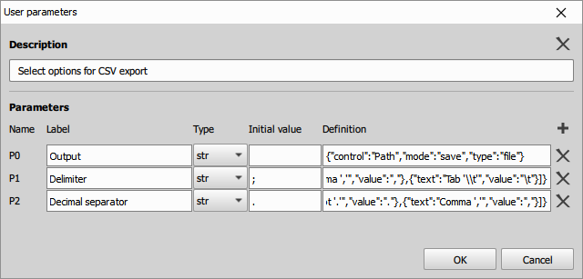
- Close the
User parameterswindow - Switch to the
User modein the top toolbar of the node. - In the newly opened window click “Skip”
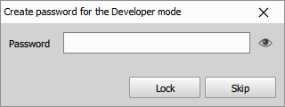
- Window should switch to User mode.
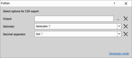
- If needed, return back by clicking Developer mode.
Results
CSV files are exported to the selected output directory, and export options can be easily modified via the custom GUI.