Results & graphs
Graphs
Modes in this group produce graphs from tables on their input by visualizing a feature values or a relation of two or more features. Features are typically columns and values are spread across rows.
The graphs are interactive as they can:
- synchronize with current frame (or loop) position
- synchronize object selection,
- select different features displayed,
- zoom and pan the graph area,
- show data information.
Row filtering
In the simplest case the graph shows the all it’s data rows in the graph. This happens on single frame dataset or when all the data is accumulated and displayed at once (e.g. frame measurement for all frames). Otherwise, if a subset of rows should be displayed it must be define in the data page. Typically it is the “Current frame” option (e.g. object features displayed for objects from current frame only). For other cases it may be “Current Z-slice”, “Current time” or other.
The selection can be let to the user to chose if more than one make sense. It can also change when such a selection changes in another result (check synchronize on receiving end).
Control dialog
The control dialog settings share many common settings.

- Title displayed above the graph.
- Legend selects the visibility and place of the legend.

- Table rows filters the data rows based on selected frame (current plate, z-stack, time …).
- Table columns defines which features are shown on which axis; starts denotes visible feature by default; selections reveals more display options per feature that can override default behavior.

- Layout tab modifies name (tooltip) and icon in stacked layout.
- Table rows dropdown lets the user select the table rows filter interactively.
- Table columns dropdown lets the user select features from the dropdown.
- Various options sets the state of the feature and it’s visibility (e.g. Autoscale ON/OFF and if the button is shown).
- Tools sets the availability of interaction tools on the toolbar.

- Axis label visibility and custom text for the axis,
- Labels formatting options,
- Range of the axis, linear/logarithmic, reversed and
- Tics and gridline definition.
Barchart
Barchart visualizes one or more features on Y axis (left and right) versus categorical X-axis. It can also operate on grouped recordsets, where the grouping becomes a 3rd nesting level.
Specific control dialog

- Categorical factors defines how the nesting and display on the axis; thew grouping and bar padding.
- Annotations can be checked to show the feature value.
This is the visualization of the above settings:

See also: Graphs (group)
Colormap
Colormap visualizes a feature values in a matrix using colors.
Specific control dialog

- Palette specifies the color map.
- Background specifies the color for values not set.
- Annotations can be checked to show the feature value.

- Table columns is simplified as only one feature can be selected.
- Table columns dropdown lets the user select features from the dropdown.
This is the visualization of the above settings:

See also: Graphs (group)
Fitplot
A graph where a fit equation and source datapoints with error-bars are plotted. It requires an output of one of the fit nodes:
The fitplot has limited settings.

See also: Graphs (group)
Histogram
A graph where one feature’s frequency is plotted.
Specific control dialog

- For numerical features the frequencies are calculated using specified number of equal bins from minimum to maximum.
- Categorical features show frequency per value (ordered alphabetically) and can be rearranged by specifying the values.
This is the visualization of the above settings:


See also: Graphs (group)
Linechart
A graph where one numeric feature is provided for x-axis and another for y-axis and another one for right y-axis. The data is sorted by x-axis feature. When the data is grouped it draws one line per group while cycling the colors.
Specific control dialog

- Palettes & markers defines the colors and if the color or markers are used for grouped data or columns.
This is the visualization of the above settings:

See also: Graphs (group)
Scatterplot
Scatterplot where one numeric feature is defined for x-axis and one or more numeric features for Y axis. Grouped records use different color.
Specific control dialog


This is the visualization of the above settings showing tracks relative to their origin:

See also: Graphs (group)
Scatterplot 4D
Scatterplot where a numeric feature is selected for every dimension x-axis, y-axis, color and dot size.
Specific control dialog


This is the visualization of the above settings:

See also: Graphs (group)
Matplotlib
Use python’s matplotlib (MPL) to create any graph from the library. See MPL workflows at Matplotlib for data visualization or MPL gallery.
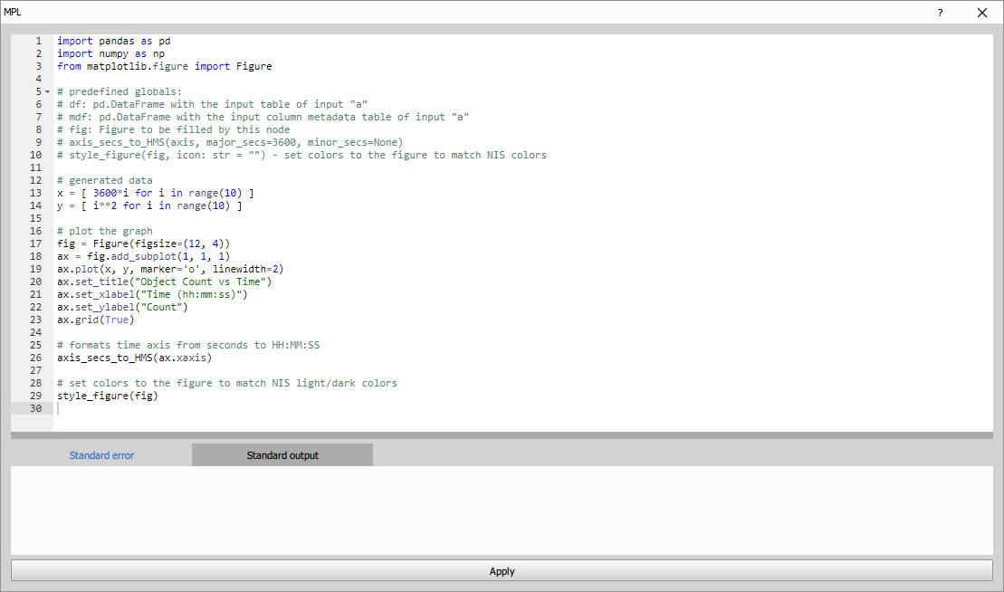
import pandas as pd
import numpy as np
from matplotlib.figure import Figure

# predefined globals:
# df: pd.DataFrame with the input table of input "a"
# mdf: pd.DataFrame with the input column metadata table of input "a"
# fig: Figure to be filled by this node
# axis_secs_to_HM(axis, major_secs=3600, minor_secs=None)
# style_figure(fig, icon: str = "") - set colors to the figure to match NIS colors

# generated data
x = [ 3600*i for i in range(10) ]
y = [ i**2 for i in range(10) ]

# plot the graph
fig = Figure(figsize=(12, 4))
ax = fig.add_subplot(1, 1, 1)
ax.plot(x, y, marker='o', linewidth=2)
ax.set_title("Object Count vs Time")
ax.set_xlabel("Time (hh:mm:ss)")
ax.set_ylabel("Count")
ax.grid(True)

# formats time axis from seconds to HH:MM
axis_secs_to_HM(ax.xaxis)

# set colors to the figure to match NIS light/dark colors
style_figure(fig)
The above python code produces following line chart.


The node produces a graph every time it is called. This is typically on every frame unless the input A is accumulated (see the guide). The display will correctly show the appropriate graph for the current frame or loop index. However, when used in reports only the first graph will be rendered as it expects single graph. In this case accumulate the input table and make subplots.
To see how to make column access more robust for later editing, see the Create Column
Helper functions and variables
Below are global variables and functions available to the user code.
# used in figure rendering
# may be modified in the script
savefig_kwargs: dict = {
    'format': 'png',
    'bbox_inches': 'tight',
    'pad_inches': 0.25
}

# defualt color cycler
datacolors_light9 = [ ... ]

# color cycler for object IDs
datacolors_objects = [ ... ]

# color cycler for track IDs
datacolors_tracks = [ ... ]

datacolors = datacolors_light9
plt.rcParams['axes.prop_cycle'] = cycler(color=datacolors)

# converts seconds into HH:MM with optional major and minor tick period
def axis_secs_to_HM(axis, major_secs=3600, minor_secs=None):
    ...

def set_color_cycler_default(ax):
    ax.set_prop_cycle(cycler(color=datacolors))

def set_color_cycler_objects(ax):
    ax.set_prop_cycle(cycler(color=datacolors_objects))

def set_color_cycler_tracks(ax):
    ax.set_prop_cycle(cycler(color=datacolors_tracks))

# styles the figure so that it uses light/dark NIS scheme
# icon is one of "histo", "line" and "scatter"
def style_figure(fig, icon: str = ""):
    ...
Use LLMs with Python nodes
It is possible to ask large language models (LLMs) like ChatGPT, Gemini or Copilot to generate python code
that will render the graph. To simplify the interaction with the LLMs there is a button Copy prompt for a LLM
which prepares a prompt ready to be pasted into the LLMs. The user has to replace the <USER TASK HERE>.
At the end of the prompt:
Task (provided by the user):
ENTER YOUR QUESTION HERE
Note that it is a good practice to create a new chat for the prompt so that it doesn’t share context with unrelated conversation.
Copy and paste the python code – replace it: Ctrl+A, Ctrl+V
- Example of a Scatterplot with confidence interval (movie)
- In the movie we show how to interact with the LLMs.
- Example of a Histogram with a Gaussian fit
- When the following question is added to the generated prompt:
Task (provided by the user):
Plot a histogram (PDF) of circularity in 20 bins.
Overlay it with a fitted gaussian curve with mean and stdev in the legend.
The ChatGPT 4o outputs code that produced following graph:

- Example of a 3D scatterplot
- When the following question is added to the generated prompt:
Task (provided by the user):
Plot Bin shape factor vs. Circularity vs. Area into 3D scatterplot.
The ChatGPT 4o outputs code that produced following graph:

- Example of a Pie chart
- When the following question is added to the generated prompt:
Task (provided by the user):
Create a Pie chart of the Class column.
The ChatGPT 4o outputs code that produced following graph:

- Example of a per-well scatterplot
- When the following question is added to the generated prompt:
Task (provided by the user):
Per-well scatterplot: LiveFillArea vs LiveMeanOfBF
The generated code can produce following graph:
")
See also: Graphs (group), Matplotlib for data visualization
Layout
Nodes in layout are used for nice presentation of the results around the image. All nodes in this group are used together. Horizontal and stacked layouts are inputs to the Display node.
Display
Display is the node that defines how the results layout with the image in NIS-Express main window. If not present (or not selected for preview) all results are stacked below the image. When there is more than than one result (e.g. a table and graph) it makes sense to include the display and Stacked layouts.
Depending on how inputs are connected some or all quadrants are used.


It has three inputs:
- Left (mandatory) that is the main one below the image.
- Right (optional) that splits the main bottom pane below the image in two parts left and right.
- Side (optional) that occupies the space besides the image.
- Report (optional) allows for a HTML Report to be shown on a button.
Only Stacked Layout and Horizontal Layout can be connected to the first three inputs.
Parameters
See also: Layout (group), Presentation of results
Horizontal
Horizontal layout is an input to the Display node. It allows for further division of the space in the panes (typically Left and Right).
It can take following nodes as input:
- all nodes from Graph group,
- Stacked layout,
- all nodes from Wellplate group
- all nodes from Tables group
- all nodes from Image group
and the output should be connected either to Display node.
See also: Layout (group)
Stacked
Stack layout is an input to the Display node. It allows for results to be stack one above the other in a pane.
It can take following nodes as input:
- all nodes from Graph group,
- all nodes from Wellplate group
- all nodes from Tables group
- all nodes from Image group
and the output should be connected either to Horizontal layout or to Display node.
See also: Layout (group)
Wellplate
The graphs in this group are schematic as they are displayed in a wellplate-like grid to provide an overview of the data. The wellplate supports navigation over wells.
In case there are more dimensions like z-stack or time-lapse the settings define if the data shown on wellplate are per whole file or per each slice in z-stack or time-lapse.
Control dialog
All graphs in this group share a very similar control dialog. It is similar to the Graphs above.
This dialog is for Bars graph, other may have few options more or less.

- Title displayed above the wellplate,
- Data range fixed minimum and maximum for all wells and logarithmic display,

- Table rows filters the data rows based on selected frame (current plate, z-stack, time …).
- Table columns one or more features (depending on the graph type) that are displayed.

- Layout tab modifies name (tooltip) and icon in stacked layout.
- Table rows lets the user select the filter interactively.
- Table columns dropdown lets the user change the features. Show, Hide are regular expressions to alter the list of features visible to the user. First show then hide is evaluated on every column. A partial match is sufficient on column name. For example “Concentration|Ratio” (where | is or) in the hide removes “Concentration” and “LiveRatio” columns.
Bars
Simplified bar chart in each well on a wellplate.

See also: Wellplate (group)
Barstack
Simplified stacked bar chart in each well on a wellplate.

See also: Wellplate (group)
Boxplot
Simplified box plot. The node requires “boxplot” aggregated values per-well. Useful for showing cell feature box plot statistics on wellplate.

See also: Aggregate Records, Reduce Records, Wellplate (group)
Dosing
Overview of wellplate dosing and control.

See also: Wellplate (group)
Heatmap
Overview of a feature value in each well on a wellplate using heatmap.

See also: Wellplate (group)
Image
Overview of well thumbnails on a wellplate.


See also: Wellplate (group)
Labeling
Overview of wellplate labels.

See also: Wellplate (group)
Linechart
Simplified line chart provides an overview of feature’s trend in every well on a wellplate.

See also: Wellplate (group)
Violin
Simplified violin plot (similar to boxplot). The node requires “violin” aggregated values per-well. Useful for showing cell feature box plot statistics on wellplate.

See also: Aggregate Records, Reduce Records, Wellplate (group)
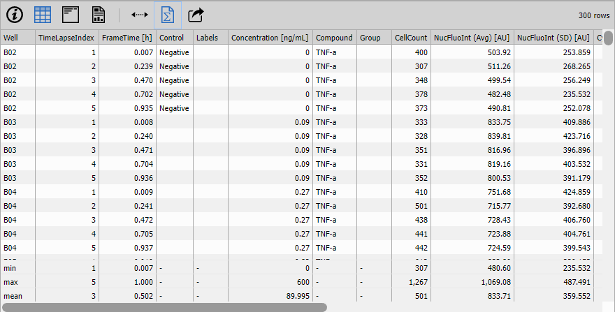
Tables
Summary
Presents the data in a synthetic form. The source table is transposed so that the column names are displayed to the left in bold and the row data (typically one or two) follow to the right.

Table
The node shows the input table as an interactive grid.
Control dialog
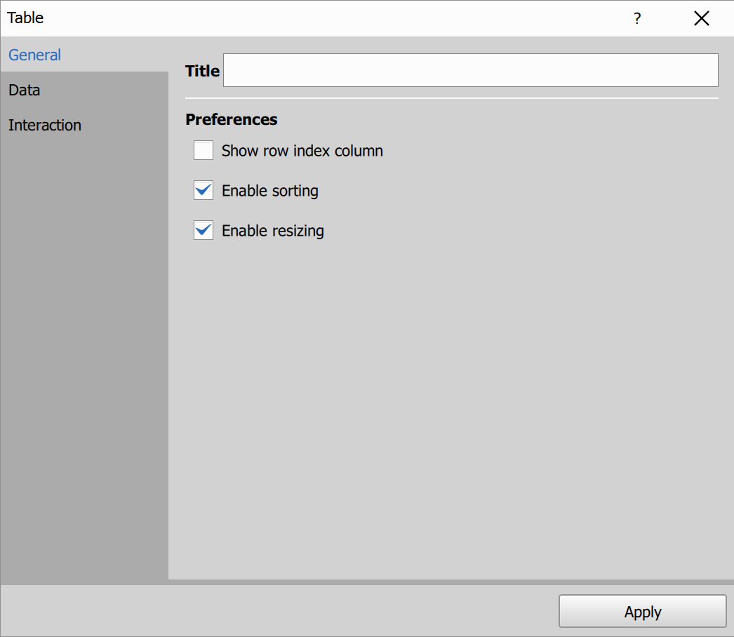
- Title: table pane title.
- Show row index column.
- Enable sorting: allows sorting rows by clicking column headers. Click the same header again to switch ascending/descending order.
- Enable resizing: allows changing column widths by dragging separators between column headers.
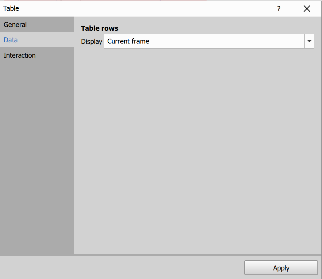
- Display: default row visibility mode.
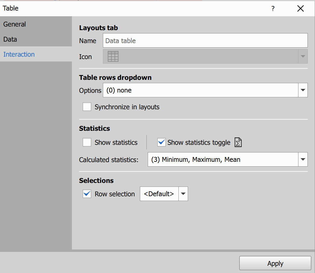
- Layouts tab / Name.
- Table rows dropdown / Options.
- Synchronize in layouts.
- Statistics defaults and toggle visibility.
- Selections: enable row selection and selection mode.
Result view
Toolbar options
- Show data for: limits rows to current frame/plate/well/point/time/Z/file.
- Auto-size: fits column widths to content.
- Statistics: shows/hides statistics rows.
- Export: copy to clipboard or save as CSV/Excel.
Selection
- Selection is active only when selection is enabled and the input table type supports it.
- Click a row: select that row.
- Ctrl + click: toggle that row in selection.
- Shift + click: select range from anchor row.
- Selection is synchronized with other result panes when applicable.
- Arrow Up / Arrow Down: move focused row.
- Space: select focused row.
- Shift + Arrow Up/Down: extend selection range from focused row.
- Ctrl + Shift + Arrow Up/Down: extend/toggle range additively.
- Ctrl + Space: toggle focused row.
Grouping
- Grouping is available only when input data are grouped.
- Groups can be expanded/collapsed in the result view.
- Arrow Right on current group: expand group.
- Arrow Left on current group: collapse group.
- Enter or Space on current group: toggle group.
- Shift + click on a group row: expand/collapse all groups from that depth downward.
Cross Table
Cross Table works like Table, but adds dynamic pivoting.
In this example, the table is pivoted by RoiId, so ROI values that were in rows are transformed into separate columns.
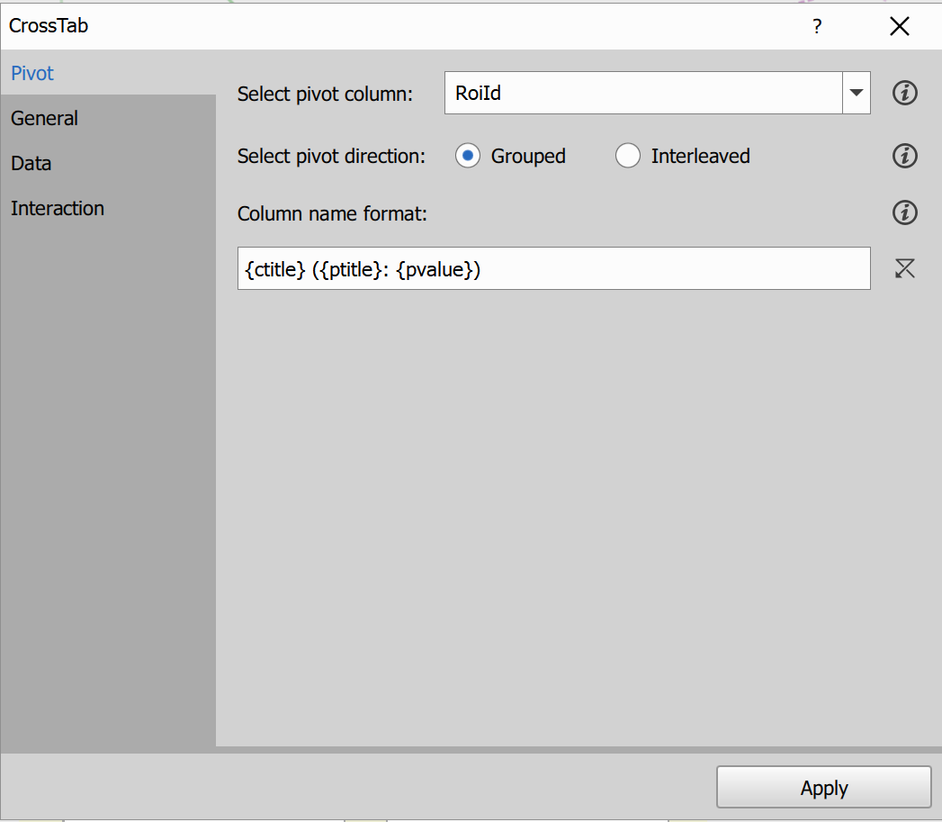
Pivot settings:
- pick one column as the pivot column,
- values from that column are turned into new columns,
- other data are rearranged into a cross-table layout.
Pivot direction controls the order of generated columns:
- Grouped: grouped by original column first, then by pivot value,
- Interleaved: grouped by pivot value first, then by original column.
You can also control generated column names using a format template.
BEFORE pivoting
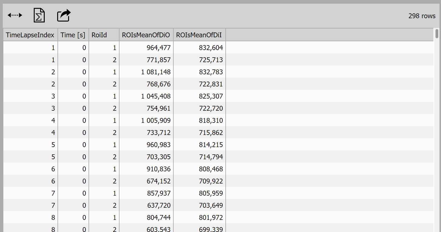
AFTER pivoting
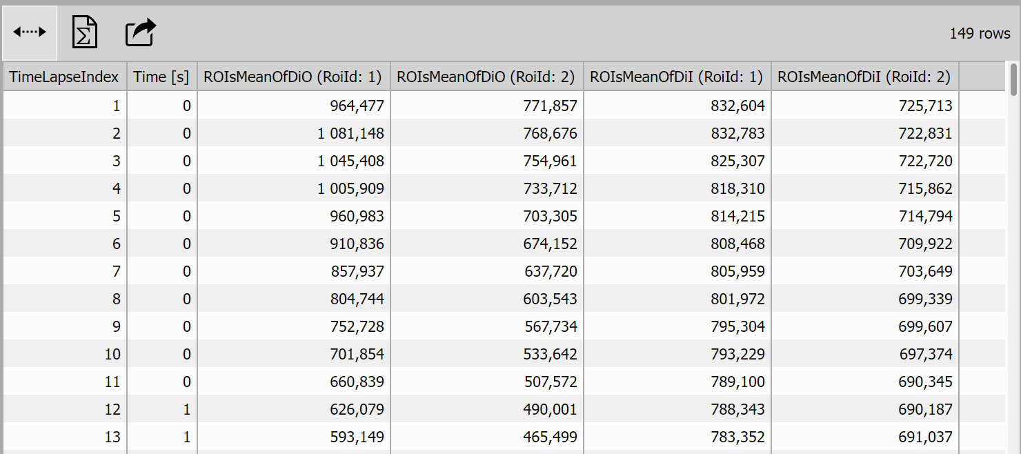
Example use: Cross-Tab pivoted table.
Table with Stats
Combines two tables one has the “ordinary” data and the other one has statistics. Both tables are combined by columns IDs. The statistics table may provide a column called “Statistics” with titles.

Image
Object Catalog
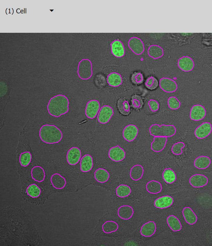
Displays segmented objects as an interactive gallery (table of image tiles). The input table must contain:
- an object ID column (
_ObjIdor_ObjId3d), and - an image/thumbnail column (
WellThumbnailorImage) with rendered object data.
In a typical workflow, the input is produced by Render Objects.
Control dialog
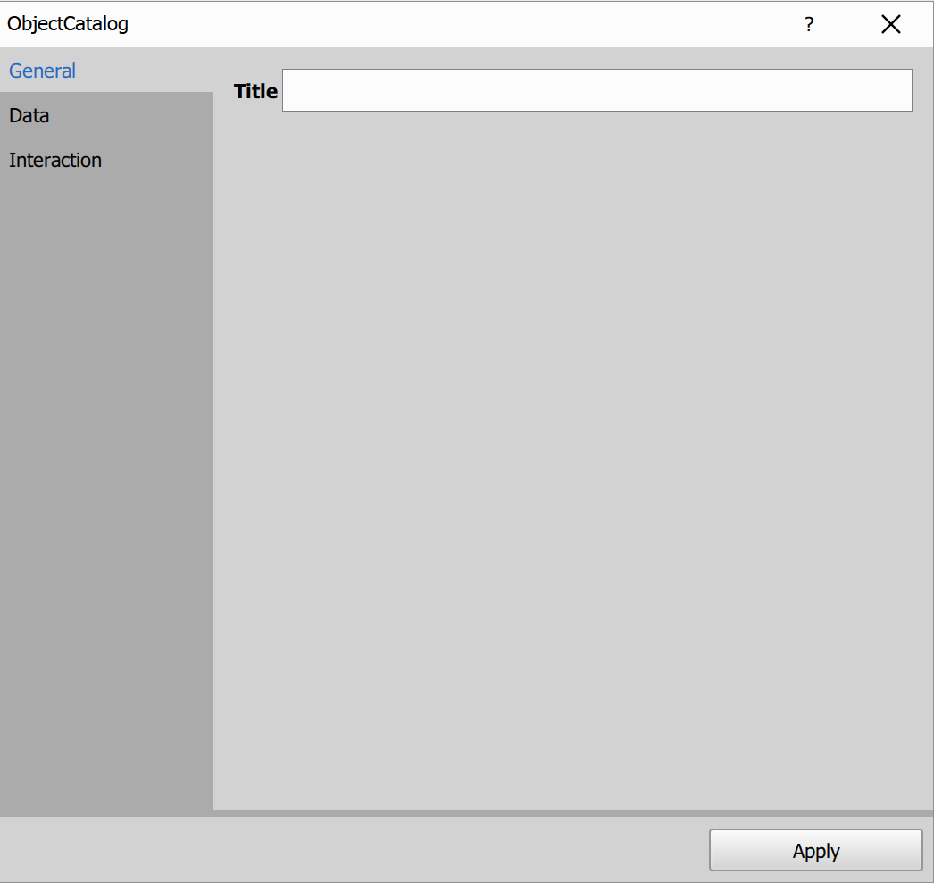
- Title: custom title shown above the catalog.
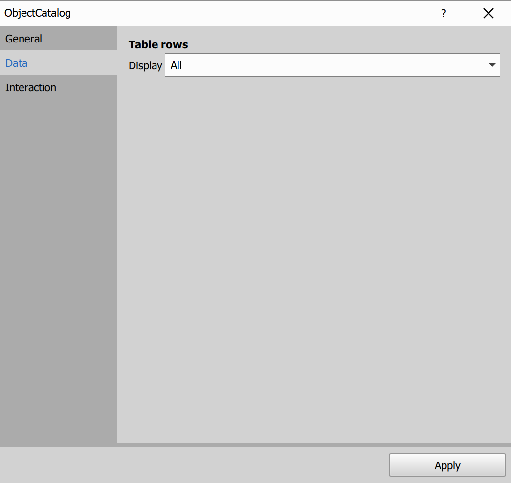
- Display: default row visibility mode.
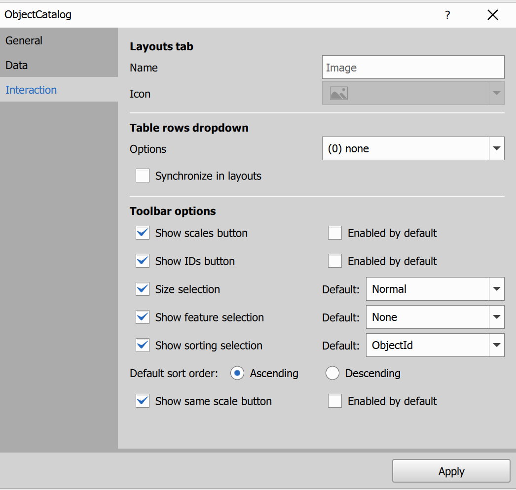
- Layouts tab / Name.
- Table rows dropdown / Options.
- Synchronize in layouts.
- Toolbar visibility/default options for scales, IDs, size, labels, sorting and same scale.
Result view
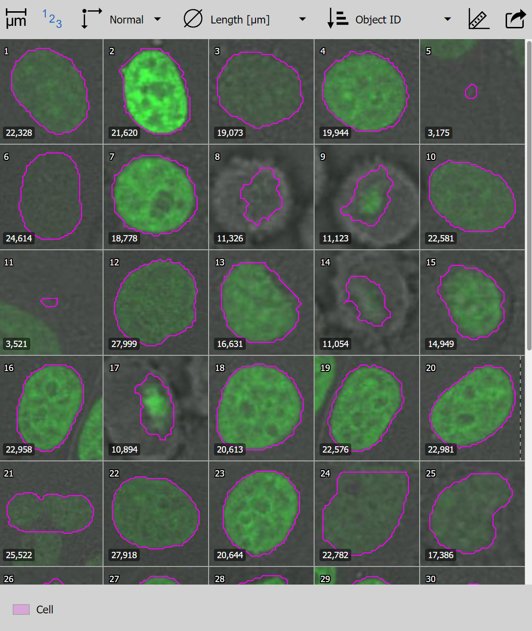
- Click: select one object.
- Ctrl + click: add/remove object from selection.
- Shift + click: range selection.
- Double click: highlights the object in the image view (when available).
- Selection is synchronized with other results using object selection.
Toolbar and dropdown options
- Show scales: toggles scale bar rendering.
- Show binary IDs: overlays object IDs directly in tiles.
- Cell size: changes tile size (
SmalltoBig). - Shown feature: selects a column rendered as a label overlay in the lower-left corner of each cell.
- Color by: colors binary overlays by a selected categorical column (if available).
- Sort by column: sorts tiles by selected column, ascending/descending.
- Same scale: normalizes tile dimensions to common scale for size comparison.
- Export PNG: exports current catalog rendering (download or clipboard).
See also: Object count workflow, Render Objects
Frame
Displays a rendered image frame in layout.
Use this node with Render Frame, which prepares the frame preview (image and optional binary overlays) for display.
Input requirements
Input table should contain rendered frame data created by Render Frame.
Result view behavior
- Shows one frame view in the layout pane.
- Supports binary overlays on top of the image.
- The main interaction is selecting which binary overlays are visible.
Node settings
General
- Title: custom title shown above the frame view.
Data
- Display: row visibility mode used in the result view (
All,Current frame,Current well, etc.).
Interaction
- Layouts tab / Name: custom tab name in layouts.
- Table rows dropdown / Options: row-visibility options available in the result toolbar.
- Synchronize in layouts: share the selected row-visibility mode across synchronized layout panes.
See also: Render Frame
Reports
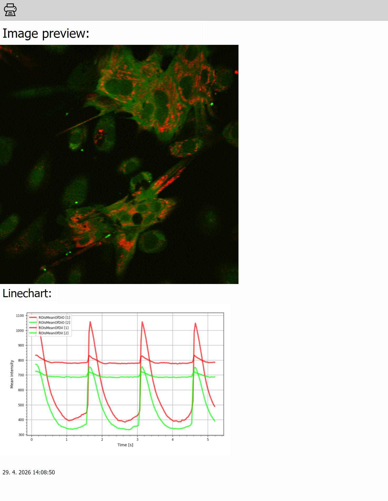
Report
The node builds a report by placing elements on an HTML page canvas.
It is separate from
HTML Report:
Report is a visual layout editor, while HTML Report is a template-based report node.
You drag and drop elements onto the canvas, connect input elements to source data, and the final report renders those connected elements in the result.
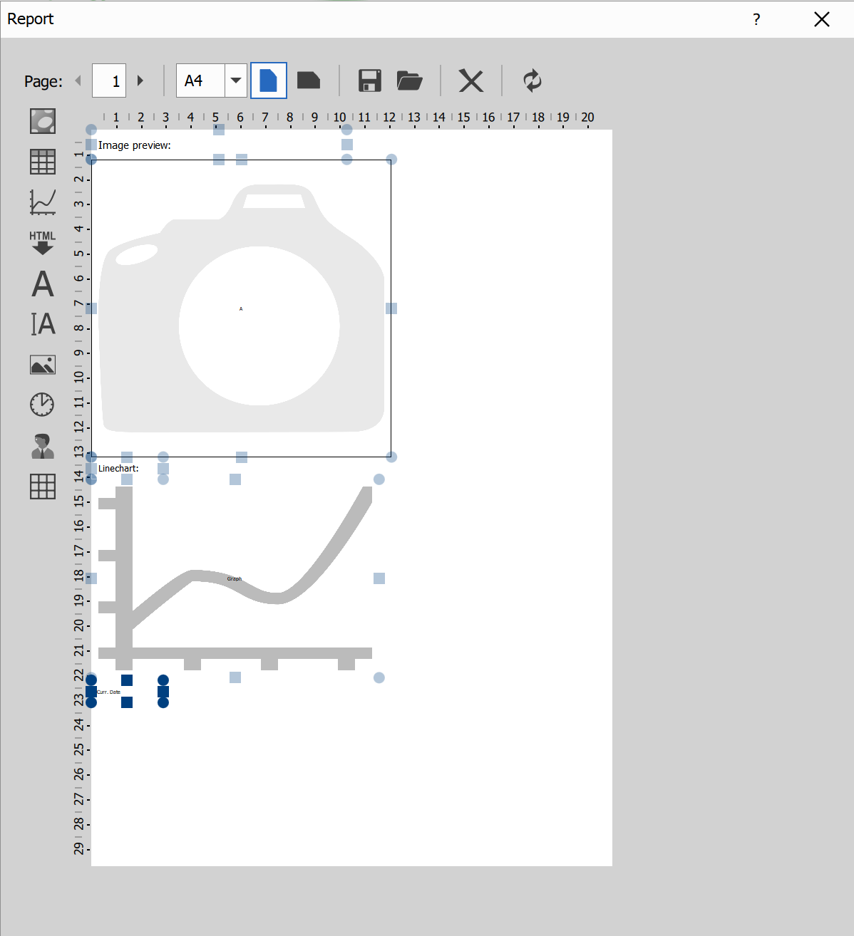
Top toolbar
- Page: move between report pages and set current page number.
- Paper size: switch page format (A4, Letter, Legal, A5, A6).
- Orientation: portrait or landscape.
- Save / Load: export the report template to HTML, or import a saved report HTML template.
- Clear: remove all elements from the current report layout.
- Refresh: update the report preview.
Left element palette
- Input image: places an image placeholder filled from connected image-type input.
- Input table: places a table placeholder filled from connected table input.
- Input graph: places a graph placeholder filled from connected graph input.
- Input HTML: places HTML content placeholder from connected HTML input.
- Static text: fixed text label.
- Edit box: text area intended for user-entered text.
- Image: image loaded from file.
- Date/time: current date, time, or datetime placeholder.
- User: current user name placeholder.
- Grid/table layout: inserts a grid-style layout container that can hold other report elements.
Adding an input-type element in the editor (for example input image, input table, or input graph) defines which input data the report expects.
Editing on canvas
- Drag an item from the palette onto the page to add it.
- Move and resize placed items directly on the page.
- Right-click an item to choose its source (for example which table/graph/image) and item-specific options.
- Input-bound elements (table, graph, image, HTML, values) render from connected data in the result.
Generate report:
Use the export button in the dialog to export the generated report to PDF.
Node settings
- htmlCode: serialized report content used by the node output.
HTML Report
Build a final static HTML report from connected inputs (A, B, C, …) using a Jinja template with optional Python and CSS customization.
General usage
What each part is for:
- Template (
source): Main report structure (Jinja + HTML). - Python (
python): Optional helper logic executed before rendering. - CSS (
css): Optional styling for the final report. - Inputs (
A,B, …): Available in template as lowercase variables (a,b, …).
Template basics:
{{ a }}or{{ a | print }}renders inputa{{ a | pane(i) }}selects pane indexi(0-based){{ a | pane(i) | item(j) }}selects itemjwithin panei{{ NOTES }}inserts user notes
Starter template:
<h1>Report</h1>

{% if NOTES is defined %}
  <h2>Notes</h2>
  {{ NOTES }}
{% endif %}

<h2>Main Output</h2>
{% if a is defined %}
  {{ a | print }}
{% else %}
  <p>Input A is not connected.</p>
{% endif %}
Practical tips:
- Guard missing inputs (
if a is defined). - Guard empty lists before using
min/max. - Prefer column IDs over visible titles in
show/hide/filter. - For an exclusive column set, use
hide='.*'with explicitshow=[...]. - Build templates incrementally:
a->a | print-> add filters/loops.
AI-assisted template generation
Recommended AI workflow:
- Click Copy prompt for LLM in the node.
- Paste into your LLM tool.
- Describe the desired report sections and required data.
- Paste generated Jinja back into the template field.
- Run and iterate.